Zen Ecosystems

Project

Application Design

Energy Management and Demand Response, IoT

Mockup of mobile app and desktop interface, ZenHQ

01

Application design across web and mobile


02

Usability, information architecture, and UI guidelines

03

My role: Product design lead for UX and UI

In my work with Zen Ecosystems, I led product design across web and mobile to tackle navigation friction, clarify role expectations, and align patterns into a lightweight design system for a smart energy and demand response platform.

Dashboard map of the United States with colored status markers for Acme Co. locations indicating Normal, Warning, and Critical alerts, alongside a pie chart showing Alert Breakdown percentages.
List of locations grouped by states California, Idaho, Washington, and New York, showing site names with statuses like ambient temperature changes, low battery alert, device offline, hub offline, and demand response updates.

Process

I combined contextual inquiry with task analysis, observing internal and external users as they executed real workflows across roles. I mapped jobs and permissions, reorganized information architecture to clarify entry points, and iterated with wireframes and prototypes. I then codified UI guidelines to unify typography, color, spacing, and component behaviors across surfaces.

Digital display showing the temperature as 73 degrees.Digital thermostat display showing temperature set to 68 degrees.Thermostat display showing a temperature of 70 degrees.Digital display showing the temperature 65 degrees.Rounded square icon displaying a green 78% percentage.Digital display showing temperature of 73 degrees.
Dashboard screen for 10 Whatney site in Zen HQ showing alerts with notes about battery replacement, runtime report, and schedule assignments, plus collapsible sections for 1st and 2nd floors.
Thermostat display for Meeting Room 1 showing current temperature 73.5°F, cooling set to 60°F, heating set to 70°F, and a note that demand response ended yesterday at 2:05 AM.Thermostat display showing Meeting Room 2 temperature at 68.8 degrees with cooling set at 60 and heating at 70, and a note saying Demand Response Ended.Display showing Reception Area 1 temperature at 70.1 degrees with icons for 60 degrees cooling and 70 degrees heating; a notification indicates Demand Response ended yesterday at 2:05 AM.Thermostat display showing 'Open Floor 1' with current temperature 65.6 degrees, cooling set to 60 degrees, heating set to 70 degrees, and a notification stating 'Demand Response Ended' from yesterday at 2:05 AM.Open floor lighting at 78% brightness, currently on, with a note indicating demand response ended yesterday at 2:05 AM.Temperature display for Reception Area 2 showing current temperature at 73.1 degrees, cooling setpoint at 60 degrees, heating setpoint at 70 degrees, and a notification that demand response ended yesterday at 2:05 AM.

Key Findings

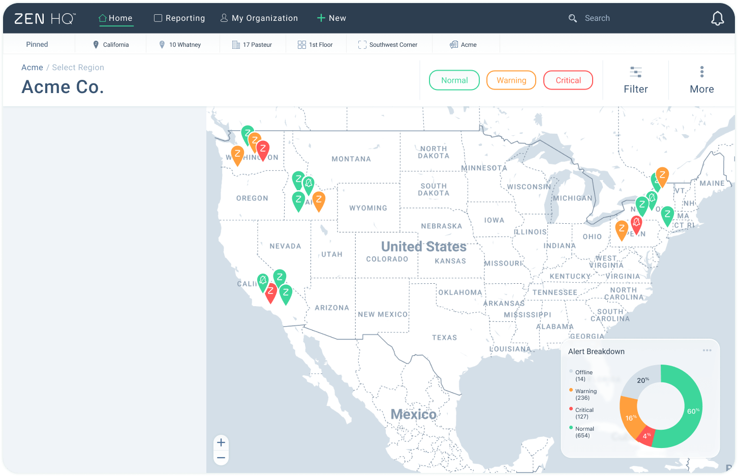
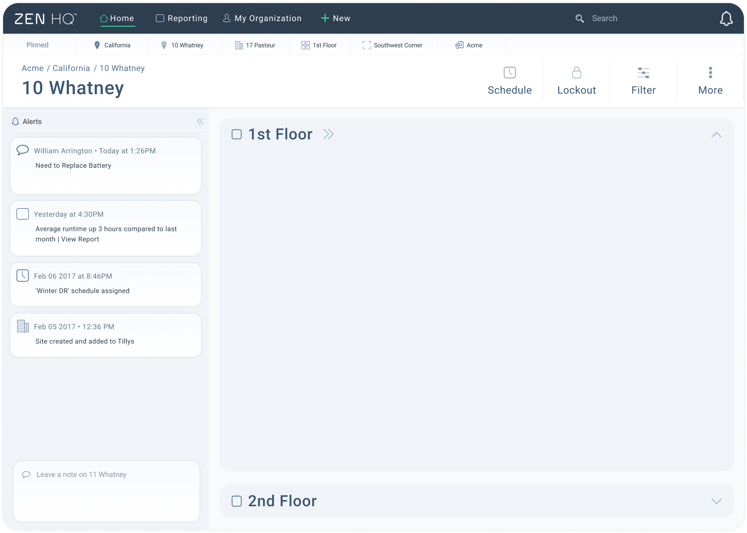
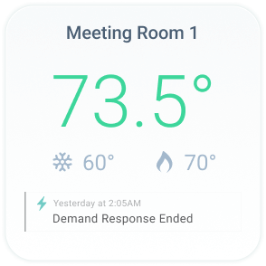
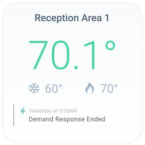
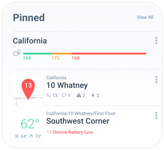
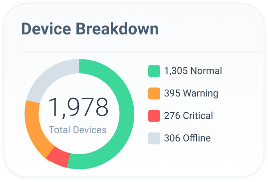
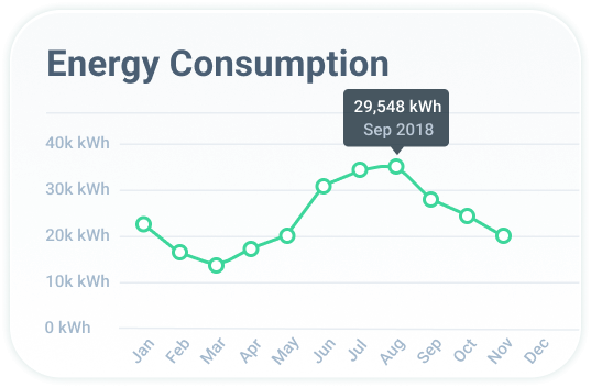
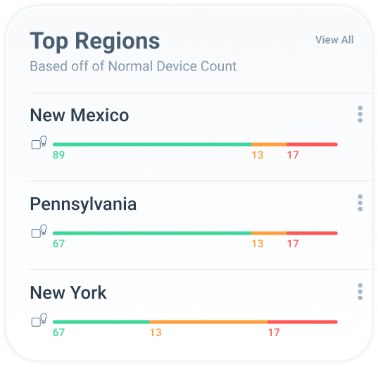
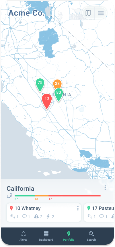
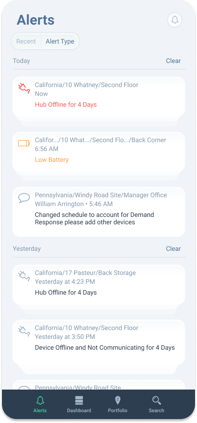
Users routinely struggled to answer immediate operational questions. The application mixed responsibilities across roles, buried status signals, and split patterns between web and mobile. People lost time determining what was happening now, what was scheduled next, and which locations or devices needed attention.

Text showing the date December 13th, 2025, above the word Dashboard in large font.Notification bell icon with a light blue outline and a small dot beneath it.
Dashboard widget titled 'Pinned' showing California with a color-coded bar and two pinned locations: 10 Whatney with alerts and Southwest Corner with a temperature of 62°F and low device battery warning.Device Breakdown showing 1,978 total devices with 1,305 normal, 395 warning, 276 critical, and 306 offline statuses represented in a colored donut chart.Dashboard titled Offline Devices listing Northeast Office, Men's Bathroom, and Back Entrance Room as device offline with temperature indicators.
Line graph showing monthly energy consumption from January to December, peaking at 29,548 kWh in September 2018.Chart showing top regions by normal device count: New Mexico 89 good, 13 moderate, 17 poor; Pennsylvania 67 good, 13 moderate, 17 poor; New York 67 good, 13 moderate, 17 poor.Chart titled Critical Regions shows critical device counts for California and Washington: California with 89 in green, 17 in orange, and 12 in red; Washington with 72 in green, 18 in orange, and 13 in red.

Design Influence

I restructured navigation around role‑based priorities, introduced clear status signaling for live conditions, schedules, and alerts, and clarified the hierarchy from portfolio to site to device. On mobile, I defined a single‑task, quick‑triage pattern set, aligning with shared components so the experience felt coherent across platforms.

Mobile app interface showing a California map with colored location pins labeled 13, 33, 75, and 80, and a portfolio summary for California with alert levels and site details.
Mobile app screen showing California sites list with colored map pins and status numbers, including 10 Whatney (red 13), 17 Pasteur (green 80), 11 Whatney (orange 33), and 12 Whatney (green 75).
Mobile app screen showing alerts including hub offline for 4 days, low battery, and device offline messages with timestamps and locations.

Outcome

The work delivered faster wayfinding for common role tasks, reduced inconsistency through shared components and a UI kit, and a clearer mental model of portfolio → site → device validated in sessions. Documentation supported engineering handoff and internal adoption. Proprietary metrics are omitted for confidentiality. MYSA later acquired Zen Ecosystems to expand into commercial energy management, and MYSA’s CEO specifically praised Zen’s “amazing product design.”